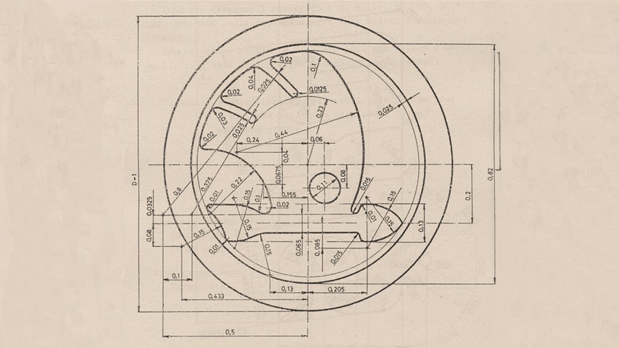
› The Škoda logo was registered at the patent office in Pilsen on 15 December 1923
› The visionary behind the winged arrow is thought to be Tomáš Maglič, the commercial director at the time
› In August 2022, Škoda unveiled a new corporate identity featuring a logo redesign for enhanced impact on digital communication channels
Mladá Boleslav, 14 December 2023 – The iconic circular Škoda logo with the winged arrow was first registered as a trademark at the patent office in Pilsen on 15 December 1923. Since its initial appearance on vehicles from Mladá Boleslav in 1925, the logo has only undergone a few modifications, with its original visual concept remaining practically unchanged. In August 2022, Škoda Auto introduced a comprehensive update to its corporate identity and also redesigned its picturemark. Aimed at improving visibility on digital platforms, this revamp ensures a more impactful look, especially on mobile devices.
The Škoda logo has adorned the Czech automaker’s vehicles worldwide since the 1920s. Today marks the 100th anniversary of its first registration on 15 December 1923 at the Pilsen patent office.
“As is often the case with historical events, it is not easy to find entirely accurate information today. Although there are several versions of the story behind the winged-arrow logo, historical sources contain solid reference points, allowing us to fairly accurately reconstruct the logo’s genesis and its subsequent modifications. The enduring logo design testifies to the remarkable talent and commitment of the graphic designers of that era.”
Andrea Frydlová, Head of the Škoda Museum
Inspired by history, now a global hallmark of quality ‘made in Mladá Boleslav’
The winged arrow is believed to have stemmed from a competition announced by the Škoda brand’s Technical Director, Dr Ing Vladislav Sýkora, while the idea itself is attributed to Tomáš Maglič, the then commercial director of the company. Maglič was reportedly inspired by a relief on the wall of his office depicting a Native American man with a distinctive headdress. However, the final form of the logo is the work of a professional. Historical sources suggest that renowned Czech sculptors Otakar Španiel or Otto Gutfreund may have contributed to its design, though their involvement remains unverified. Ultimately, two versions of the winged arrow were created – one with five feathers and the other with three. Both were registered as trademarks of the Škoda company on 15 December 1923 at the patent office in Pilsen. However, the graphically cleaner and visually simpler design with three feathers above the flying arrow soon became the preferred choice. Initially, the logo appeared on locomotives manufactured in Pilsen; it wasn’t until the 1925 merger with the carmaker Laurin & Klement that this emblem was also featured on vehicles from Mladá Boleslav.
The meaning behind the logo
The Škoda logo embodies the brand’s commitment to high technical and aesthetic standards, and precise manufacturing, as well as symbolising the dynamism of forward motion. Each element of the logo reinforces this message: The large circle represents the global reach and impeccable nature of Škoda’s production, while the wing denotes technological advancement, the range of production, and global distribution. The forward-pointing arrow signifies progressive manufacturing processes and efficiency, while the smaller circle, reminiscent of an eye, symbolises the precision of Škoda’s engineering, expertise, and foresight. The winged arrow has historically been used on cars, genuine parts and Škoda’s information and communication materials. Remarkably, it has only undergone five noticeable modifications and colour variations in 100 years.
Subtle changes over the century
In its original form, the logo had a metallic base, hence the use of silver and blue. In the 1950s and 1960s, the logo also appeared in red, and was frequently paired with the Škoda wordmark. Between 1993 and 1994, the blue colour was replaced by green. At the same time, the surrounding circle was expanded to accommodate the Škoda Auto lettering. However, this iteration was short-lived: in 1994, the logo evolved to a more sculpted look, with the outer green circle becoming black, while the green winged arrow emphasised the brand’s commitment to the environment. The logo on the vehicles incorporated the Škoda wordmark and a laurel wreath at the bottom of the surrounding circle. In 2011, the design was replaced with a modern, lighter variant featuring green, silver, and black elements. In 2022, Škoda introduced a significant update to its corporate identity, the most radical change in 30 years. The refreshed logo enhances the brand’s appearance on digital channels, especially on mobile devices and offers greater flexibility across various formats.
A century of the winged arrow
One hundred years ago, on 15 December 1923, the Škoda trademark was registered. The iconic flying arrow bearing three feathers symbolised speed and progress. See how the logo on the bonnets of Škoda cars has changed since then.
The winged arrow has featured in various forms on cars made in Mladá Boleslav since 1925, when it replaced the original circular Laurin & Klement logo.
Back when it all started, the Mladá Boleslav-based company used the patriotic name Slavia for its products, i.e. bicycles. In the firm’s decorative logo and on the simplified metal plate, the logo was complemented by the surnames of the company’s founders: Laurin & Klement. The same was true for motorcycles, produced from 1899 onwards. The advent of automobile production (1905) ushered in a distinctive circular logo with the initials L&K, complete with a laurel wreath around the perimeter. This reflected the fact that major motorsport achievements were already part of the company’s DNA at that time. The calligraphic inscription Laurin & Klement, resonating with Art Nouveau elegance, also appeared in communications and on car radiators until the end of the 1920s.
A symbol of speed and progress
On 15 December 1923, the Škoda trademark with the flying arrow was officially registered to a company that was not the car manufacturer from Mladá Boleslav. This was, of course, the new logo of Škoda Works, an engineering firm based in Plzeň. The company simultaneously patented an alternative with five feathers and integrated Škoda lettering that was never actually used.
This was the result of more than a year-long search for a suitable trademark, which began with a public tender. Among some three hundred designs, a variant resembling the head of an Indian chief with a feather headdress won out. The name of the logo’s designer will probably remain a mystery forever; it may have been a collective work, gradually modified by various departments of the company. The reduction from five feathers, which as it were keep the arrow in flight, to three was due to the fact that the new trademark, used on a wide range of products, had to be clear even when it was quite small and moulded or cast in three dimensions. For these reasons, the additional word Škoda was also eventually dropped.


